
AT&T Interactive Applications
2019 | UX | UI | STB
Interactive Mix Applications, designed for the 10’ Viewing Experience function like Live Info Screens & Dashboards, supplementing the user with information about the live event. ITV Apps tap into the fan factor, engaging it’s huge sports fan segment with score/standings updates, team & player tracking, and more in context during game and event airings.
Below (left) is an example of a Movie Info Screen, which provides data about the movie, other showings, etc. Likewise, the PGA App (to the right) provides data about the tournament.
App Entry Points
The apps overlay experiences are easily accessed from the Menu, App Tower, Mix Channel, or via Snipes that appear over related live video.
Events Covered
The roadmap includes special sports editions, released each year as companion apps for seasonal events like March Madness (The Bracket), Golf Masters, MLB, Tennis Grand Slams, the Olympic Games, and others.
DIRECTV covers ~20 events per year.
Templatization Effort
As the main product designer on a feature team of 4, I worked on updating the UI/UX for several Interactive Mix Applications, through a Templatization Effort.
I audited the previous years’ applications to identify similarities and patterns that existed across the different builds, which was key in constructing a set of flexible template types that could be referenced and re-used for future events. These design patterns were later integrated into the broader DIRECTV component library, helping standardize layouts and accelerate development for new interactive TV experiences.
We no longer had to treat each application as one-off experiences. The update helped to…
Form Consistency & Organization between applications
Identify & Synthesize features that could enhance 10’ viewing experience
Minimize & Reduce Development Efforts
Additionally, I made updates to the UI to match the new genie design effort. For example here is the golf leaderboard that was updated in the new UI & utilizes the List Template…
Process
In addition to User Testing & Research, I conducted a competitive audit when re-designing each application so I could implement effective strategies employed by other services.
Research —> Research Synthesis —> Ideation & Design —> Design Evalutation —> Final Design
To boost creativity and collaboration, I led brainstorming and whiteboarding sessions with my core team. We aligned every idea with our Product Identity principles—"Alive" (thrilling, immersive experiences) and "Spirited" (thoughtful, context-aware design). This ensured our solutions were both innovative and true to our brand values.
To design the applications, I used our component library in Sketch along with tools from Adobe Creative Suite. I also used OmniGraffle to document the wireframe specifications. Here is an example:
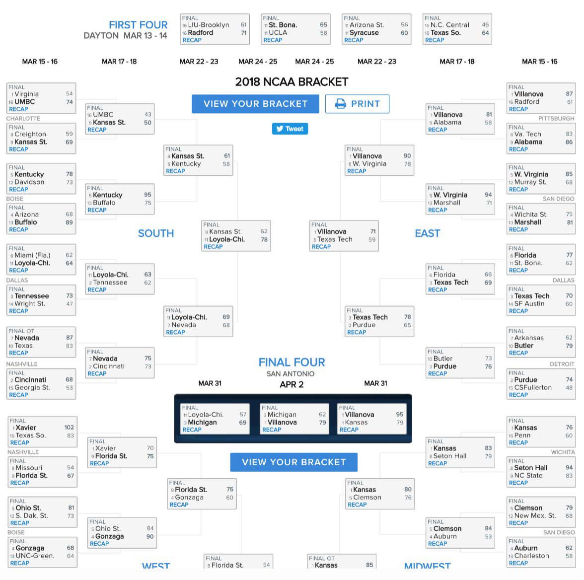
ITV APP 1 - March Madness
I analyzed the NCAA, ESPN, and YAHOO March Madness brackets and applied our competitive insights to redesign our application and remedied the following issues with the 2018 March Madness Application.


Problem & Solution 1
In the original application, users needed to go to two separate areas to “View Picks” and “View Scores” .
View Picks
View Scores
I fixed this disjointed experience by combining the two separate domains on to one screen with “pre” and “post” states. Essentially once the user is in the View Scores state which means the games have started they should not have access to View Picks since they can’t change their picks anymore.
Pre - Round 1
Post Round 1
Problem & Solution 2
From my competitive audit, I saw that Yahoo! allowed users to track their incorrect picks. I thought this experience would really enhance the user experience of our application so we updated our experience to match this.
Yahoo!
Updated Experience
Problem & Solution 3
There needed to be more emphasis about the Bracket Locking in before the first game starts. Originally we only had a footnote to denote that picks can no longer be made. However, since the system was broken users could modify their picks after the first game starts. I resolved that issue in Problem 1 but now provided a functional solution.
Before
After
Furthermore, I extended the countdown to the Home Screen Landing page…
Before
After
Additionally, I added a “Today’s Schedule” to align with other applications.
Today’s Schedule
ITV APP 2 - Golf
I analyzed the MSNBC & Masters Golf iPad application. Based on the Competitive & BAU audit, I made changes to the hierarchy of info, leveraged our new template styles, and found ways to enhance the visual experience.


Center Panel Update
I moved left menu data to the center panel to create more room and visibility of player info. This opportunity allotted us the space to leverage player headshots.
Before
After
Player Scorecards
I first used the grid template moving left panel info into the center panel.
Before
After
When re-designing the Golf Player Scorecard itself we explored how we could minimize clutter, build a hierarchy of information, and minimize button presses.
Before
After (Default)
After (Scrolled)
Groupings & Tee Times
Again moving data from the left panel to the center panel helped to leverage more metadata and utilize our list and grid design templates…
Before
After
Measuring impact
Before the redesign, interactive TV apps had low engagement — viewers dropped off early, navigation was clunky, and each event required a time-consuming custom build. Average session time was just 6 minutes, and under 75% of users completed actions like viewing scores or making picks.
I redesigned the experience with a modular template system, simpler navigation, and a unified “Scores & Picks” flow, making the apps easier to use and faster to launch across events.
Within the first year of rollout:
Development time per event dropped by 42% thanks to reusable templates
Average session time during live games increased by 22%
Task completion for key interactions rose by 17 percentage points
Annual event launches expanded from 12 to 20 using the same core system
The redesign transformed a fragmented, hard-to-scale experience into a cohesive platform that boosted user engagement while cutting production time nearly in half.
Conclusion
The Interactive Applications work initially lacked a unified design system, leading to an inconsistent user experience. Through the Templatisation Effort and UI Updates rolled out in 2019, I created a more cohesive and intelligently organized interface. The Center Panel Update further enhanced usability and visual appeal while allowing room for new features.