
Visual Design Concept

I refined my digital design skills in a Visual Design course at General Assembly in 2019. The course focused on the principles of typography, color theory, and layout composition. The course allowed me to further develop my user interface design skills and share my evolving design talents. My capstone project, Soul.Verse, designed in Sketch offers a personalized music discovery experience, engaging users with diverse playlists for a unique and intuitive listening experience.
1 - Competitive Audit
While analyzing the user interfaces of Spotify, SoundCloud, and Apple Music in a competitive audit, I observed the pivotal influence of design on the user experiences.


SoundCloud's appeal lies in its new track or album visuals, bright orange CTAs, and a balanced, uniform presentation of music artwork in carousels.
Spotify's design highlights large cover art and banners, personal discovery via a left panel, bold headers and green CTAs, and uses circles and squares to distinguish between albums and artists.
Apple Music's interface combines large visuals with colorful gradients, size variations, and unique track/album treatments for visual hierarchy and extensive discovery options.
2 - Mood Board & Color Palette
For the moodboard, I meticulously chose visuals from unsplash.com to span a broad emotional and environmental range, crafting a panorama from serene landscapes to vibrant urban scenes. Each image highlights the contrast between solitude and community, shaping the thematic vision for the application.

Moreover, the mood board’s showcase of artistic spirit underpins a feature enabling users to curate and amalgamate tracks, thereby creating distinct soundscapes that honor the uniqueness and creative vitality inherent in every individual. This exercise really helped me construct the application’s color palette.

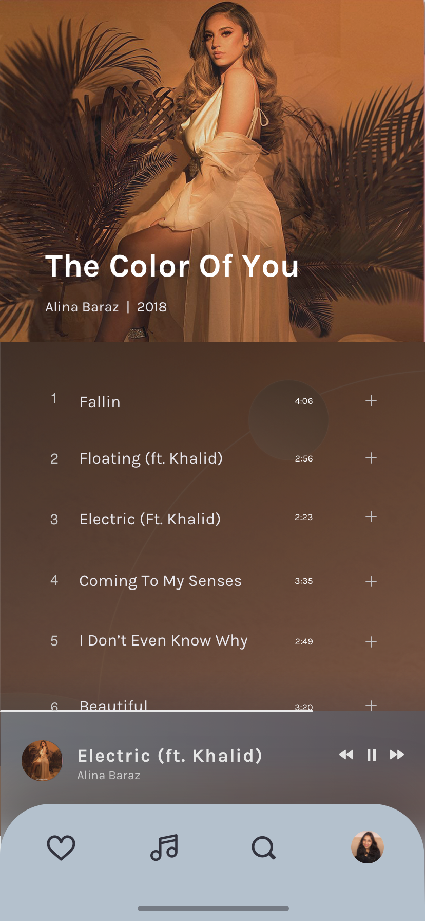
4 - Mobile UI Concept
Leveraging insights from my competitive audit, I developed UI screens for a music app focused on seamless, personalized experiences. The design journey begins with a home screen offering curated and recent tracks for a personal touch, incorporates minimalist play controls and lyric integration for engagement, and concludes with an easily navigable album overview. Each screen emphasizes curated playlists, recent songs, and engaging features like lyrics, all unified by a cohesive color scheme and typography for visual appeal and user ease.


5 - Web Landing Screen
After several design iterations, the landing screen design for the music streaming app Beat.box was chosen. Beat.box invites users to embark on a 'journey through a galaxy of sound.' It's a clear call to action for a personalized musical experience, encouraging users to start a free trial. The interface highlights the ability to discover music tailored to different moods, with a sleek design showcasing a featured song (updates daily) and mood-based playlists like 'meditation,' 'party,' and 'romance.' The design's clean, modern aesthetic promises a vast selection of tracks, emphasizing easy exploration and a custom listening experience.
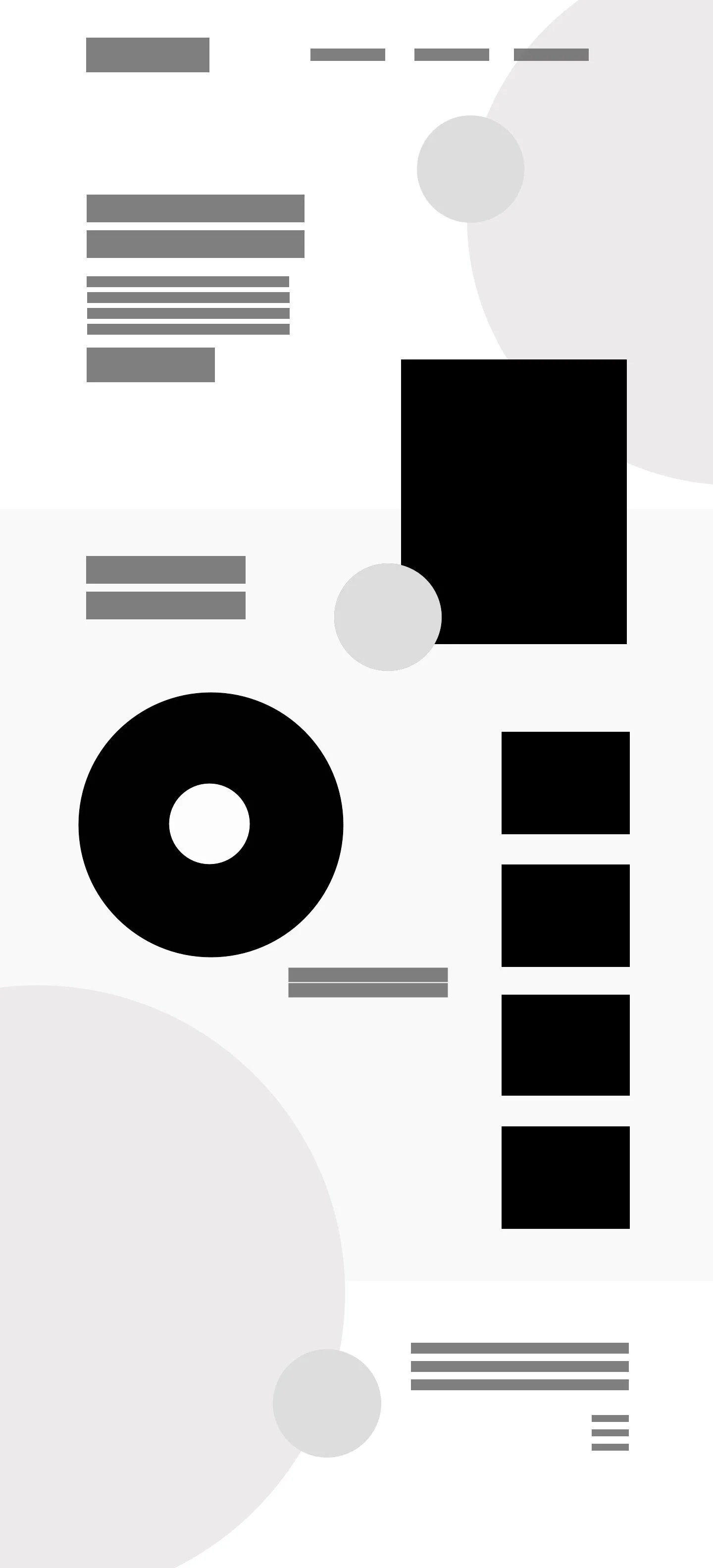
6 - Gestalt Principles
I used the principles of Gestalt design to organize the landing page’s visual elements, creating a harmonious whole rather than just a collection of parts. The positioning of shapes and lines leverages the Gestalt principles of similarity, continuation, and closure, to create a sense of balance and structure. The varying sizes and placements of the shapes help to suggest a hierarchy or flow that guides the viewer's eye through the composition. My aim was to create an organized and aesthetically pleasing visual field (utilizing a grid for framing) that appears unified and complete to the observer. I started with black and white and then added color. Eventually, this was the skin that was used to craft the high fidelity landing page design above…

7 - Conclusion
The course equipped me with a solid foundation to approach any design task. Through the practical application in my capstone project, Beat.box, I exercised the delicate balance between functionality and aesthetic, crafting an interface that is both intuitive and delightful to the user.
The practical component allowed me to translate abstract concepts into tangible design solutions. The creation of a mood board furthered my understanding of the emotional impact of visual elements, guiding the emotive direction of my design. Each step—be it laying out a mobile UI or conceptualizing a web landing screen—was an exercise in creative problem-solving. From the gestalt principles that informed my landing page's composition to the meticulous curation of playlists for the app, every choice felt purposeful and informed.